Thursday, August 29, 2019

Postcards: Plant, Animal, Object -- the origin story

Hello, friends!

As you might have noticed, I go through waves of being a impulsive Kickstarter.  I want to Kickstart and Patreon all the things!  If it weren't for this pesky being poor thing, I feel I was destined to be a patron of the arts.  I could have a fleet of artists working for me.  It would be glorious.

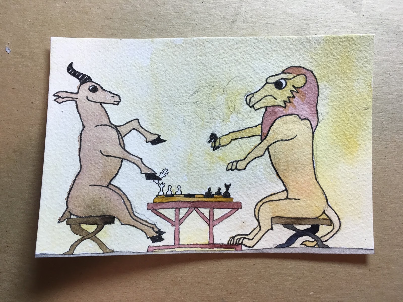
But back on track!  I Kickstarted a book of postcards by Shing Yin Khor, and it recently arrived.  It is amazing!  Carley and I were both ooohin and awwwing over it.  Huge fans of the art.  The art also feels very approachable.  It is deceptively... something.  It looks simpler than it is.  And so, what a good jumping off place for me to start improving!


I started trying to really look at it.  Pick out things I could try to incorporate into my postcards.  One of the things I latched onto was the variety of objects in each composition.  It is 0% how my brain works;  I knew I needed outside help.  

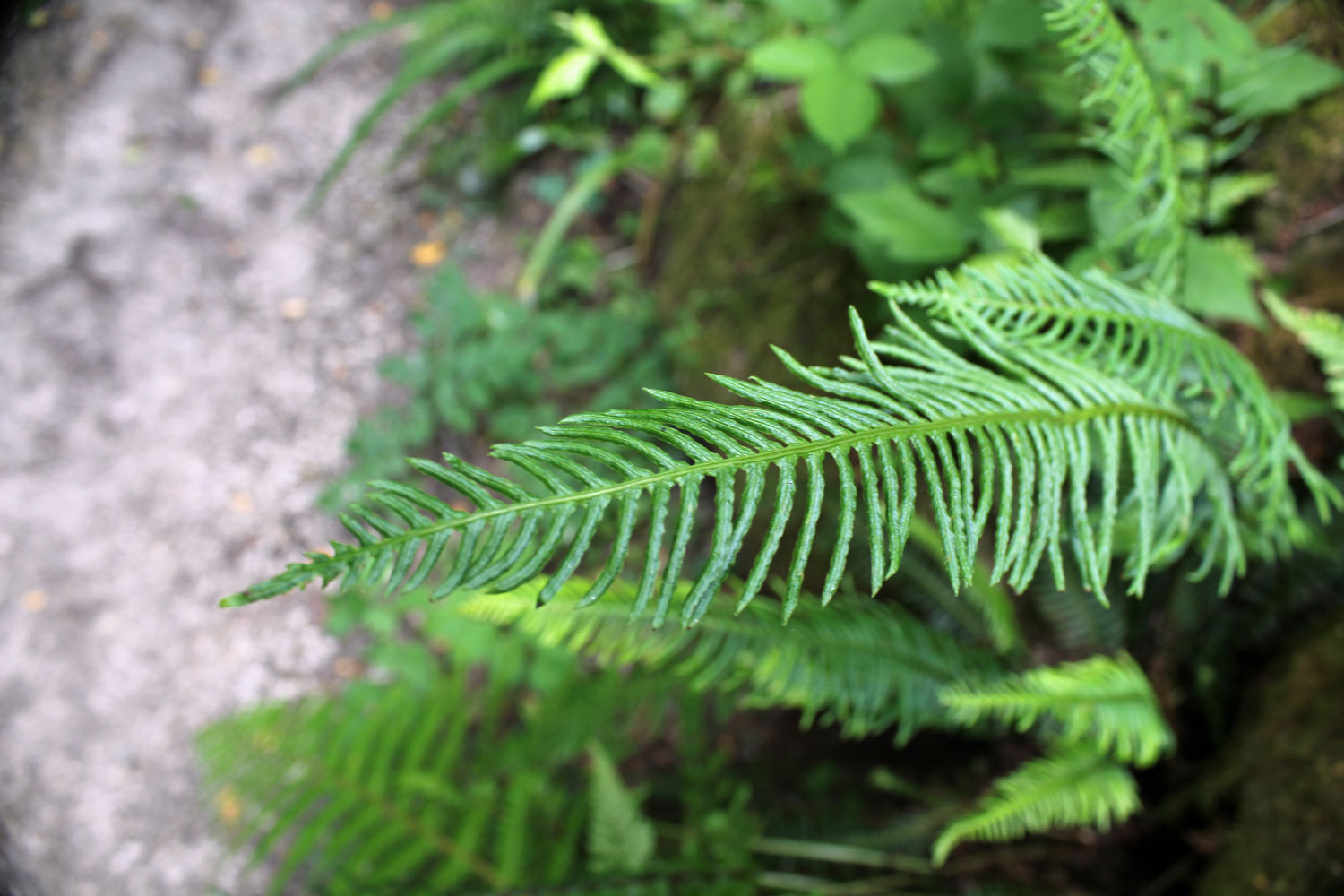
I started asking my friends, beginning with Ross, for an animal, an object, and a plant.  Ross tends to take my request and then make them as difficult as possible, so I pushed for not that.


You can see him still leaning towards being ridiculous.  A prehistoric fern?  How is that different from a contemporary fern?  How do I source that image?  How will the audience know?  Still, it was a good place to get started, and that's what I needed the most.  No constraints is not good.

The next step was dig up some inspiring images.


I am really bad about considering the background first, but looking at Shing's work, it was clear I needed to get some color down before I started penciling things in.


Ok, next up, some fine pipes in opposite corners, forcing myself to not orient all my elements the same way.


The field mouse, which becomes the visual anchor, and, despite my earlier efforts, discourages rotating the image.


I went with the fossilized fern, and then threw in the beetle.  I feel like both of them can be rotated any direction and still look appropriate.


Boom!  My first postcard in this style.  Hopefully it looks less like my usual scribbles and more harmonious.  If you compare it to Shing's work, I am still probably only at 50% the complexity their art.  I probably won't make it to a comparable level, but I feel like I am growing in the right direction.


Monday, August 26, 2019

Postcards: Learning about Patterns

Hello, friends!  This week is crazy enough I don't what, if anything, I'll get done between here and mid-September.  Just bear with me, and who knows, maybe you'll get the delightful surprise of regular posts.  Maybe I'll collapse into a shivering ball of anxiety.  Who can say what the future holds!

In keeping with the recent theme, I saw Tanya Heidrich's work on Instagram and saved it to think about later.  Tanya is a black & white illustrator and pattern designer.  They posted the half finished pattern below, allowing me to piece together roughly how I could achieve similar results.


Feeling like I had the basic idea, I got to work laying down some pencil guidelines.  I went with a vaguely face shaped pattern in the center, and then I inked it up.


The pattern is alternating simple squares and beveled tiles.  Or at least that's the best way I have of describing it without just drawing it in front of you.


I went with a pretty simple white/hatched/black pattern, but I am thinking of revisiting this pattern with different hatching styles and maybe some color.


Thursday, August 22, 2019

Postcards: Sea Gods

I love using stamps in my art.  I love the art in Griffin & Sabine.  I love mysterious letters and packages.  I love the post-ness of postcard art.  However, I tend to try to fit the stamps on at the end.  They're not quite an afterthought, but I rarely have a plan other than "dump out all my stamps and hope something works."

For this postcard, I chose a stamp first.  I traced roughly where I wanted to stamp to go, and then started building my composition accordingly.


That I might explore a new style, I turned again to Instagram for some inspirational images.


Armed with some aesthetic guidance, I went to work.


Boom!  I finally added the Qatar stamp.  The composition still felt a little unbalanced, so I also added the other kind of stamp.


Monday, August 19, 2019

Postcards: More Lines equals Better?


Are you familiar with the megaliths of Bada Valley?

I wasn't either!  But then I started seeing images like this on Instagram.


Pretty neat!

I thought the browns and the greens and the grass versus the rock would give me some color and texture to play with.  I was a fool.

I like the pencil drawing I did.


And then it all started to go wrong.


Well, if the watercolor is a disaster, there's no harm in just throwing markers at it, is there?


Saturday, August 17, 2019

Postcards: Clerical Error Bonus Episode

I made this card, but I forgot to scan both sides.

I have no idea who I sent it to, which is unfortunate, both for my record keeping but also I think this is one of my more satisfying designs.


If I sent you this card, shoot me a message; I will remove it from the Misc. folder.


Thursday, August 15, 2019

Postcards: The Gazelle and The Lion

In my Instagram art reference collection I found these animals playing a board game.


Pretty cool, right?  It has a bit of an illuminated manuscript feel to it, to me.  I like the texture and the earth tones.

It felt both like something I could draw and like something not specifically my style, so I went for it.


Are you wondering about that cloud of pencil lines across from the gazelle?  That's the remains of a wasp I thought was unsuccessful. 


I did not feel like I had the skill to make it clear that parts of the legs were below the water level.  Drawing something floating is hard.

So I abandoned it, erased it, and used the card for Gazelle and Lion card.


I think I only used three colors beyond white and black.  Maybe four; I might have used two yellows.  Since part of the appeal of the inspiration image was the earth tones, I stuck to brown, red, and yellow.


Okay, so I lied a little bit.  I forgot about the grey along the bottom, and I was not counting the ink I used for the texturing.  The grey is an earth tone, I would argue, and the ink was brown.  I was basically not lying, and it got you to keep the tones in mind as you watched me build up the image.

Next up, as I usually do I started seeing if I could work stamps into the layout.  I sent Jen the following two images and asked for her advice.


Her advice boiled down to "odd > even."  I went with a three stamp approach, and used the numbers to sneak in a Cincinnati shout-out.