Monday, June 25, 2018

Postcards: Erasers On Our Pencils

This is one of my recent favorites.  I have a copy of Fallout Protection: What to Know and Do About Nuclear Attack.  I bought it to chop it up for collage, but so far I have been unable to.  

I really like this illustration.  It's not quite six inches wide, so I thought I'd redraw it to match the scale of the blank postcards.


You know me, it needs more.  I pulled in another quote from the Bluejackets' Manual, but then felt I needed a third element.  Boom!  Add a jewel encrusted skull.


Thursday, June 21, 2018

Postcard: Look, O'Malley

Look at this dog's unsettling eyes.  It looks like a painting a Scooby Doo villain is hiding behind.


Then there's this guy.  He was offering his opinion on fallout shelters before I cut him out.


A couple of chops...


and now he is a picture with a Scooby Doo-esque villain behind it.


And then some texture-y stuff.


Thursday, June 14, 2018

Postcards: Aaron's Moth

After painting Dagny's Moth, I had moth fever!  And by that I mean I knew I had to paint at least  one more.  So I went with this guy.


The Isabella Tiger Moth, the end result of the Woolybear.  See all those gradations?  That subtlety?  Subtlety is my natural enemy, but I went for it anyway.

Kick off with the usual "does this fit here."


Get some colors in there.


The right wing is what I was aiming for, but I accidentally darkened the left wing too much.  It was very disheartening.


I decided to darken the right wing to even things out, and then move forward.


From there, just some finishing touches.  I emphasized some shadows to make edges clearer, and the antenna were added in with white paint.


Thursday, June 7, 2018

Postcards: Dagny's Pet Moth

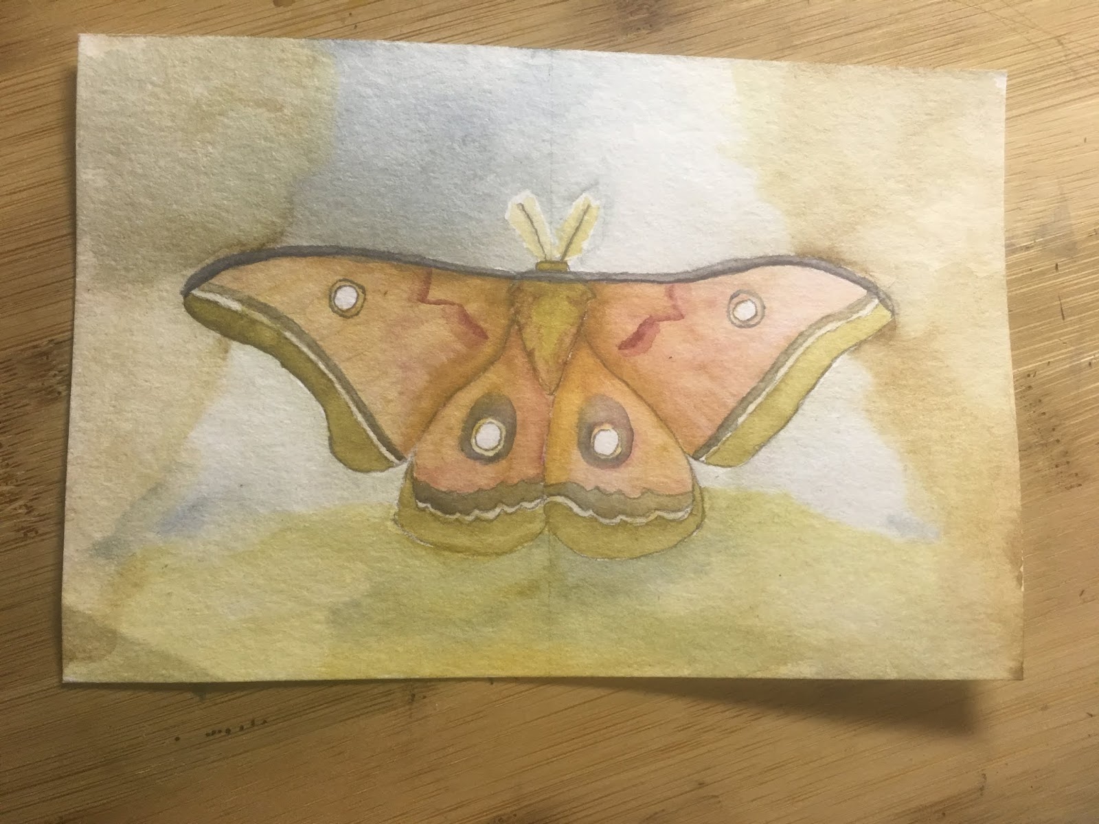
Dagny found two cocoons.  When the first one hatched, it was a male polyphemus.  She posted this picture of it on her hand, which I used as my primary reference.


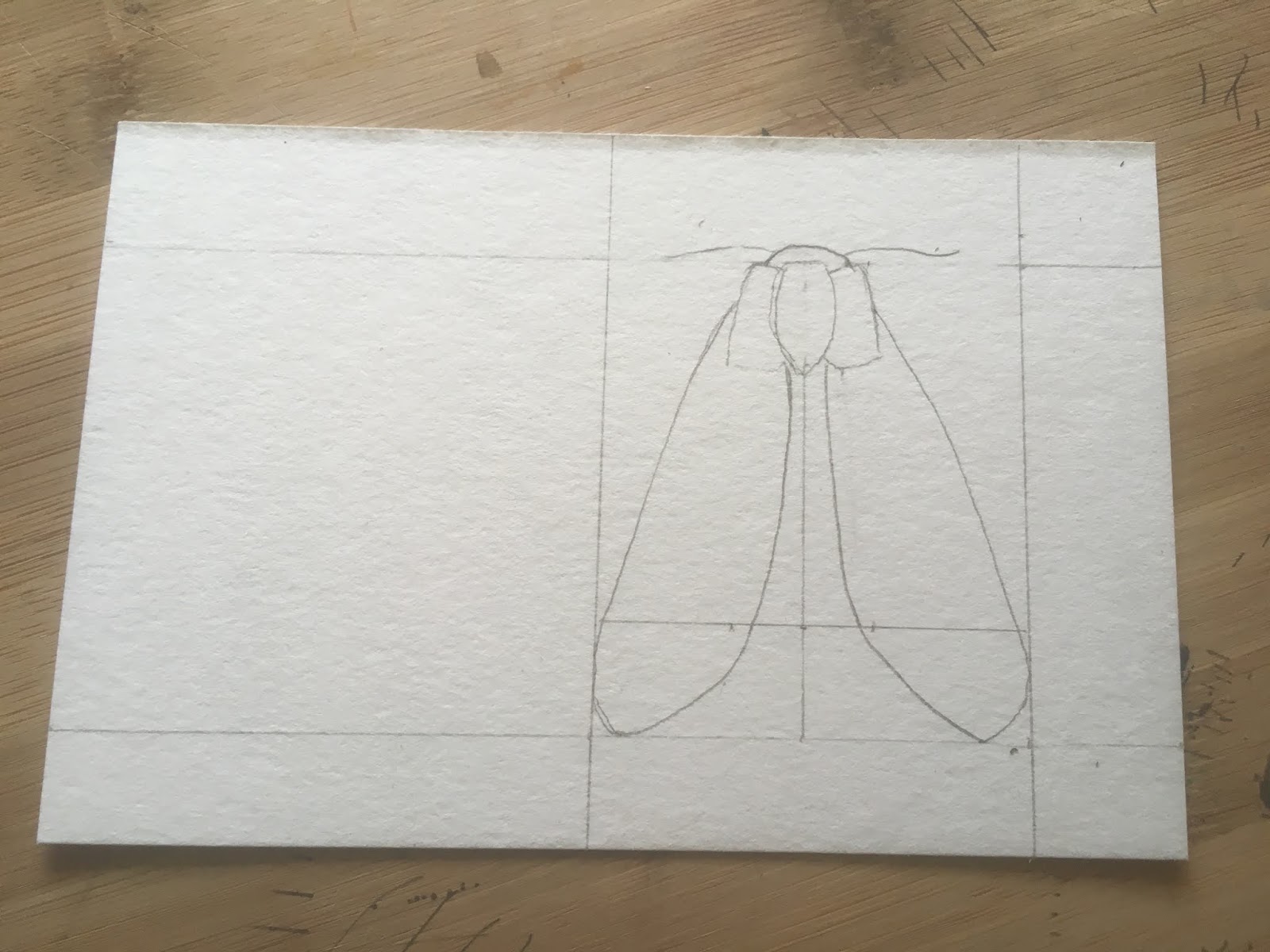
As usual (but not always), I began with just trying to make sure it all fit on the card.


That looked pretty good. I know things always move around a bit as I add color; might as well start laying down some paint.


The background in the primary reference photo looks good in the photo, but I was not confident I could lay down my greys in a way that looked good.  To add a little interest, I went with a background inspired by the next photo she posted of the moth.  Here the translucency of the wings is apparent, but I don't think I have the skills yet to pull it off.  


It was at this point I asked myself why I had decided to draw in the screen.


Monday, June 4, 2018

Postcards: Simple and weird

I have seen my fair share of maps with seemingly meaningless You Are Here dots.  My brain being my brain, I thought "if you just send someone an otherwise blank card labeled 'You Are Here' it will be correct no matter where they are."  I can't follow my own design ideas, and started adding more dots.  It looked sparse (which was the point, but whatever), so I added the Questionable Design label.  Now maybe Questionable Design can be a series of cards.