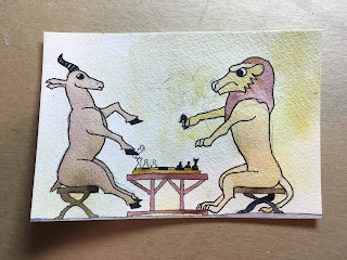
In my Instagram art reference collection I found these animals playing a board game.
Pretty cool, right? It has a bit of an illuminated manuscript feel to it, to me. I like the texture and the earth tones.
It felt both like something I could draw and like something not specifically my style, so I went for it.
Are you wondering about that cloud of pencil lines across from the gazelle? That's the remains of a wasp I thought was unsuccessful.
I did not feel like I had the skill to make it clear that parts of the legs were below the water level. Drawing something floating is hard.
So I abandoned it, erased it, and used the card for Gazelle and Lion card.
I think I only used three colors beyond white and black. Maybe four; I might have used two yellows. Since part of the appeal of the inspiration image was the earth tones, I stuck to brown, red, and yellow.
Okay, so I lied a little bit. I forgot about the grey along the bottom, and I was not counting the ink I used for the texturing. The grey is an earth tone, I would argue, and the ink was brown. I was basically not lying, and it got you to keep the tones in mind as you watched me build up the image.
Next up, as I usually do I started seeing if I could work stamps into the layout. I sent Jen the following two images and asked for her advice.
Her advice boiled down to "odd > even." I went with a three stamp approach, and used the numbers to sneak in a Cincinnati shout-out.


No comments:
Post a Comment